Focus on Your Ride, Feedback at a Glance
Feedback and validation of your performance in just a tenth of a second. This is why and how we do it:
Why
At Absolute Cycling, we believe your ride should be your primary focus. The One delivers precisely the right feedback, exactly when you need it—without pulling your attention away from the road or trail. The core function of a cycling computer is simple yet essential: you, the rider, are delivering a performance. And during your ride, you want that effort validated. We break this down into a few key questions:
- Where am I?
- Where can I go?
- How fast am I going?
- How fast can I go?
Here’s how we make it happen:
Screen Design
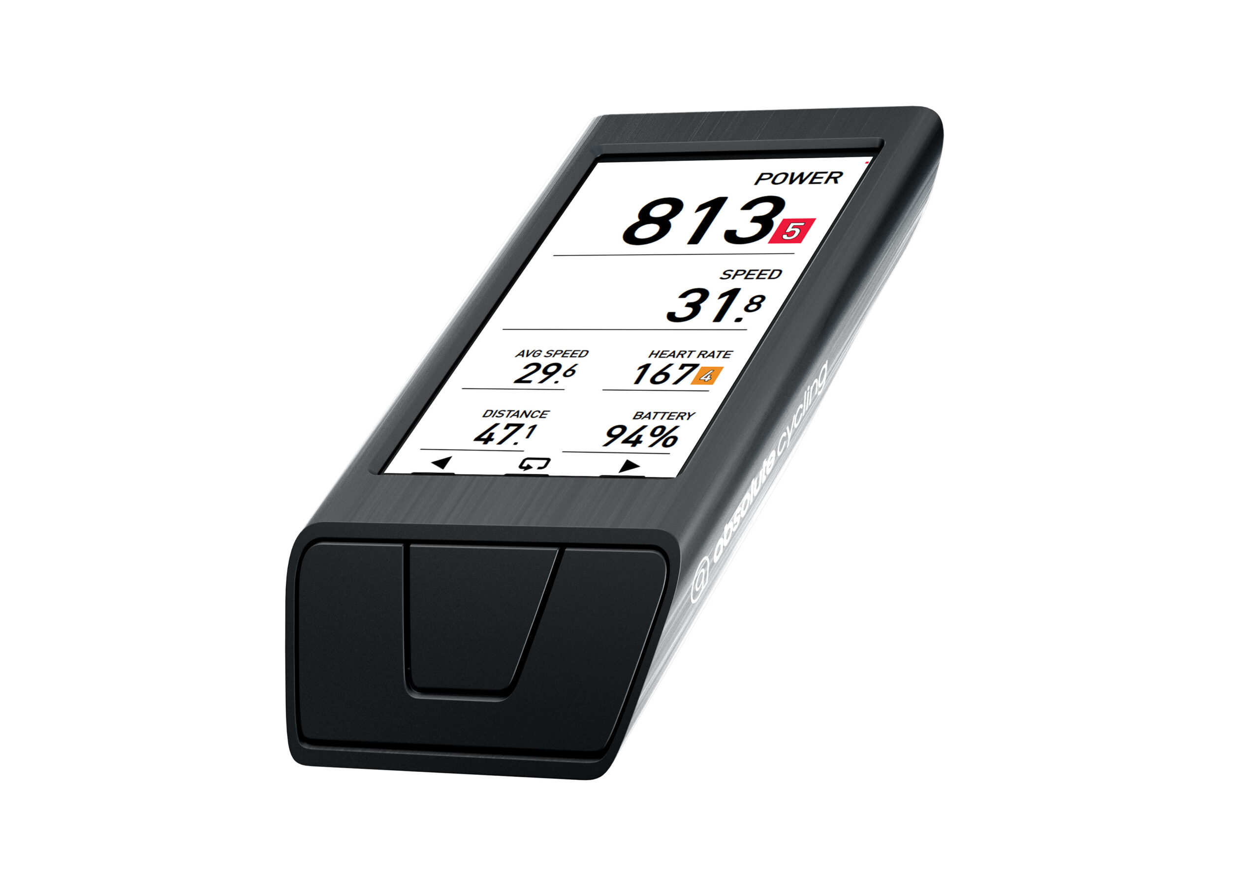
The One features a spacious 3.1-inch display with the highest resolution on the market, but we focus on showing only the essentials. No cluttered symbols or extra icons—just the information you truly need, keeping your attention on the road. Generous white space ensures your eyes find the data effortlessly, without searching for it.
We chose DIN 1451 for all metrics on The One. This font, originally designed for road signs, ensures easy reading even in motion—ideal for quickly understanding your ride data. Using this font consistently across all texts and numbers, users can absorb the information with minimal effort, staying focused on the ride.
Our colors, from maps to metrics, are carefully selected for readability. We use highly saturated tones to make key details stand out, combined with a strong contrast ratio to highlight important changes like elevation or route differences. This approach is grounded in cognitive ergonomics, helping your brain process data faster.
Instantly Recognize Your Surroundings
When navigating, it’s crucial to confirm you’re on the right path and see what lies ahead. Our maps are built for cyclists, providing clear, distraction-free guidance. We use intuitive, universally recognizable colors: blue for water, light green for fields, dark green for forests, gray for urban areas, and striped lines for train tracks. These familiar cues make it easy to understand your surroundings at a glance, letting you stay focused on your ride.
Minimal Control, Maximum Focus
The controls of The One are designed to keep you focused on the road or trail, not the device. We chose not to include a touchscreen because swiping and tapping demand your attention, turning the device into a distraction. A touchscreen often leads to a desire for more in-ride features, shifting focus away from the ride.
With The One, there’s no compromise on advanced features—they’re all available but accessed in a streamlined way. Three simple buttons let you scroll through screens, zoom in and out, and start or stop a ride. That’s it. All other settings are managed through our app before you start riding, so you interact less with the device during your ride. The result is a calmer, safer, and more focused experience, with the assurance that the information you need is always right where you need it.
